

2 Lipstick Starters for Indian Skin: Terracotta or Blue Berry

Identify your undertone first, then pick a shade family that complements it and matches your skin’s depth. That single sequence, undertone before depth, prevents most of the mismatched lipstick purchases Indian skin tones deal with. If you need two safe starting points right now, try a warm terracotta nude or a blue-based berry, then swatch both on your inner lip and check the color in daylight before you commit.
TL;DR:
- Matching undertone first and then selecting a shade depth prevents common lipstick mismatches on Indian skin tones, especially between warm and cool tones.
- Warm undertones favor terracotta, caramel, and orange-based lip shades, while cool undertones suit berries, true reds, and blue-based reds for contrast.
- Darker skin depths require more saturated, high-pigment formulas to avoid a chalky appearance, with opacity being critical for deep complexions.
- High-pigment matte formulas maintain true color and undertone accuracy better than sheers or glosses, which tend to shift the shade’s appearance.
- Swatching on the inner lip, testing in natural daylight, and layering with liners or glosses improve shade accuracy and longevity, regardless of occasion.
Table of Contents
- How Do You Determine Your Undertone for Indian Skin?
- Which Lipstick Shade Families Actually Flatter Indian Skin?
- What Lipstick Shades Work Best by Skin Depth?
- Which Lipstick Formula Shows True Color on Indian Skin?
- How Should You Swatch and Test a Lipstick Shade?
- What Application Habits Prevent Lipstick Mistakes?
- What Do Rebecca and Luméra Cosmetica Recommend for Matching Shades?
- How Do You Adjust Lipstick Shade for Different Occasions?
- Does Lip Shape Affect Which Lipstick Colors and Techniques Work Best?
- How Does Lip Health Affect the Way Lipstick Looks?
- How Do You Coordinate Lipstick With Makeup and Outfit Choices?
- Why the Undertone-First Method Beats Trend-Chasing
- How Lumeracosmetica Makes Shade Matching Easier
- Sources
- FAQ
How Do You Determine Your Undertone for Indian Skin?
Undertone and depth are not the same thing, and confusing them is the single biggest reason a lipstick that looked perfect in the store turns muddy or chalky at home. Depth is how light or dark your skin is. Undertone is the color running underneath that depth, warm (gold, yellow, peach), cool (pink, blue, red), or neutral (a mix of both). Undertone is the primary factor in choosing a flattering shade, and depth simply tells you how intense that shade should be.
A few tests work reliably across Indian skin depths, though each has a catch worth knowing about.
- Jewelry test: if gold jewelry makes your skin look richer and healthier, you likely lean warm; if silver does the same, you lean cool. On deeper skin, both metals can look flattering, which usually signals a neutral undertone.
- Inside-lip test: the skin just inside your lower lip is close to your true undertone, without the tan or sun exposure your face and hands carry. Pink or reddish tints suggest cool; peachy or brownish tints suggest warm.
- White fabric or neutral paper test: hold a plain white t-shirt or a sheet of white paper next to your face in daylight. Skin that looks golden or sallow against it usually runs warm; skin that looks rosy or blue-toned usually runs cool.
- Sun reaction: if you tan easily and rarely burn, that’s typically a warm-leaning trait. If you burn before you tan, cool undertones are more likely, though this test is far less reliable once you’re past light to light-medium depth.
- Vein test, with a caveat: the classic advice, green veins mean warm, blue veins mean cool, breaks down fast on deep skin, where veins are harder to read clearly and can appear muddy or indistinct regardless of undertone. Treat this test as a tiebreaker at most, never as your primary signal.
When your tests disagree, which happens more often than beauty guides admit, default to neutral. Neutral undertones can wear both orange-based and blue-based shades within a family, so you have more room to experiment without a costly miss.
Pro Tip: If three out of four tests point the same direction, trust that direction. If they’re split evenly, buy the neutral or slightly muted version of a shade before committing to its warmest or coolest edge.
Which Lipstick Shade Families Actually Flatter Indian Skin?
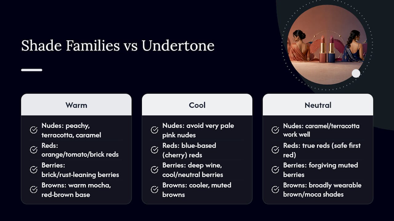
Once you know your undertone, shade families stop being a guessing game. Each family has an internal logic, warm and cool versions exist within nudes, reds, berries, and browns alike, so the family you pick matters less than the specific version within it.
Nudes cause more regret purchases than any other category, mostly because “nude” gets marketed as one universal shade when it’s really dozens. Peachy nudes flatter warm undertones at fair to light-medium depth. Caramel and terracotta nudes work across wheatish and dusky depths, especially for warm and neutral undertones. Editorial advice consistently points toward warm-toned nudes like terracotta and caramel, while cautioning that very pale, pink-based nudes tend to wash out medium to deep Indian skin rather than flatter it.
Reds split cleanly along undertone lines once you know what to look for. Orange-based reds, the ones with a tomato or brick quality, suit warm undertones and tend to look richer on wheatish and dusky depths. Blue-based reds, closer to cherry or a classic “red carpet” red, suit cool undertones and read as high contrast and striking on deeper skin. True reds, sitting between the two, work for neutral undertones or as a safer first red if you’re still confirming which direction you lean. Makeup communities frequently recommend blue-based reds for contrast on deeper complexions and orange-reds for warm undertones, which lines up with what most professional colorists teach. Lumeracosmetica’s own guide on picking the right red lipstick for your skin tone breaks this down shade by shade if reds are where you want to start.
Berries, plums, and wine shades run cool to neutral, and they tend to be more forgiving than reds because their muted quality hides small undertone mismatches. A cool-toned dusky complexion can wear a deep wine almost year round. A warm-toned complexion should look for berries with a slight brick or rust undertone rather than a true blue-purple, which can skew ashy on warmer skin.
Browns and mochas are the closest thing to a universal category, mostly because brown lipstick sits close to many Indian skin tones’ natural lip color, so the undertone mismatch that ruins a bright shade barely registers in brown. A warm mocha with a red-brown base suits wheatish and dusky depths especially well, while a cooler, more muted brown works better for lighter, pink-leaning skin.
The scaling rule across every family is the same: as your skin gets deeper, the shade needs more pigment saturation, not just more darkness, to avoid looking chalky or faded. A pale terracotta that reads beautifully on light-medium skin can turn dull and flat on deep skin unless you move up to a richer, more saturated version of that same terracotta family.
What Lipstick Shades Work Best by Skin Depth?
Depth tells you how far to push a shade’s intensity, but it works hand in hand with undertone, not instead of it. Here’s a practical starting point for each depth range.
| Skin depth | Shades that work well | Shades to avoid |
|---|---|---|
| Fair | Peachy nudes, dusty rose, soft coral | Stark white-based pale nudes |
| Light-medium / wheatish | Warm terracotta, mauve, coral-red | Cool blue-pink shades that clash with warm undertones |
| Dusky | Rich caramel, brick red, deep berry | Low-pigment pale nudes that look ashy |
| Deep | Mocha, espresso, deep terracotta, wine | Sheer or chalky formulas lacking opacity |
Fair skin has the widest margin for error, but it’s also where washed-out nudes do the most damage, turning lips nearly invisible instead of polished. Peachy nudes and soft corals give color without disappearing. Dusty rose works well for cooler fair undertones looking for something office-appropriate.
Light-medium and wheatish skin is where undertone starts mattering more than depth. Warm terracotta and coral-red shades tend to look intentional and put-together on wheatish skin, while the same skin in a cool mauve can look surprisingly elegant if the undertone actually leans cool rather than warm. Test both directions before assuming.
Dusky skin handles saturation beautifully, and this is the depth range where playing it safe with pale shades backfires most. Rich caramel nudes, brick reds, and deep berries all read as rich rather than muddy. Low-pigment pale nudes, on the other hand, are the single most common mistake at this depth, they tend to look gray or chalky rather than soft.
Deep skin needs opacity above almost everything else. Mocha, espresso, deep terracotta, and wine shades in high-pigment formulas look luxurious and deliberate. Sheer, low-opacity formulas in any shade family tend to disappear into a faint sheen rather than showing true color, so opacity should be your first filter before you even think about the shade name on the tube.
Which Lipstick Formula Shows True Color on Indian Skin?
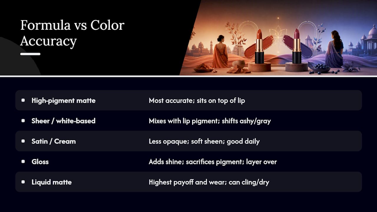
Formula changes how a color reads almost as much as the shade itself does. High-pigment matte formulas translate color most accurately on melanin-rich lips, because they sit on top of the lip rather than blending into its natural pigment. Sheer or white-based formulas, by contrast, often mix with your lip’s own color and shift toward ashy or grayish, especially on wheatish, dusky, and deep skin.
Satin and cream finishes trade a little opacity for comfort and a soft sheen, a good middle ground for daily wear. Gloss gives shine and dimension but sacrifices the most pigment, so it’s better layered over a liner or lipstick than worn as your only source of color if you want the shade to actually show. Liquid mattes tend to have the highest payoff and longest wear, but they can also grip onto dry patches and transfer less predictably than a traditional bullet formula, which glides more evenly if your lips are already smooth.
Before buying, run a quick mental checklist: does the swatch stay true to the tube color once it’s on skin, does it hold its color for a few hours, and does it feel comfortable rather than tight or drying. Types of vegan lipstick formulas vary a lot in how they perform on this checklist, so it’s worth knowing which finish you’re buying, not just which shade.
Pro Tip: If a shade looks slightly different in matte versus satin, trust the matte version to show you the color’s true undertone. Satin and gloss both add a layer of shine that can soften how orange or blue a shade actually reads.
How Should You Swatch and Test a Lipstick Shade?
A swatch on the back of your hand tells you almost nothing useful, hand skin and lip skin rarely match in tone. A short wear test in natural light catches problems that in-store lighting hides completely, and it takes less time than most people assume.
- Swipe a small amount on your inner lip first, this is closest to your true undertone and shows you how the shade blends with your natural pigment before it’s spread evenly.
- Apply a fuller swatch to your actual lips, both a light layer and a fully opaque layer, since some shades change character depending on how much product you use.
- Step into natural light, near a window if you’re indoors, and compare how the color looks against store lighting, which almost always distorts warm and cool tones.
- Wear it for a short wear test in natural light before deciding. Watch for the color shifting warmer or cooler as it settles, and check how much transfers onto a cup or tissue.
- If the shade is close but not quite right, use a liner one shade deeper to anchor it, or layer a sheer gloss on top to shift the finish without changing the underlying color.
Pro Tip: Keep a small notes app list of the exact shade names that pass your wear test. Building this list over a few months is faster than starting from scratch every time you shop.
What Application Habits Prevent Lipstick Mistakes?
Prep matters more than most people realize. Dry, flaky lips grab pigment unevenly, and any lipstick, no matter how well matched, looks patchy over rough skin. Exfoliate gently once or twice a week and follow with a hydrating balm. If you’re wearing a liquid matte or another long-wear formula, a lip primer helps it apply more evenly and last longer without cracking.
Ashiness usually traces back to two culprits: a low-pigment formula or a shade with too much white or gray mixed into its base. Choosing a higher-pigment formula, as covered above, solves most of this on its own. If a shade still looks slightly ashy once applied, warming it up with a touch of gloss or layering a warmer-toned liner underneath can shift it back toward flattering.
Liner does more than outline. Filling your whole lip with liner before applying lipstick, in a shade close to or one step deeper than the lipstick itself, extends wear and lets you nudge the final color warmer, cooler, or more intense. For evening wear, a common trick is adding a second layer of the same lipstick after blotting, which deepens the shade without needing a different tube.
- Exfoliate weekly, hydrate daily, and use a primer for long-wear formulas.
- Choose high-pigment formulas over sheer ones to avoid ashy results.
- Line lips fully, not just the edges, for a longer-lasting, more adjustable shade.
- Blot and reapply for evening depth, switch to gloss over stain for a lighter daytime look.
Pro Tip: If a red or berry shade looks slightly too cool or harsh for daytime, dab a touch of clear or peach-toned gloss over the center of your lips. It softens the intensity without changing the shade you already committed to.
What Do Rebecca and Luméra Cosmetica Recommend for Matching Shades?
Rebecca’s approach comes down to a short checklist rather than a long list of rules: confirm undertone with at least two tests, match depth to saturation rather than just darkness, and always test in daylight before deciding a shade is wrong.
A few practical notes worth keeping in mind:
- Warm undertones rarely need a true cool-toned shade to look polished, a warm-adjacent neutral almost always performs better.
- Deep skin benefits more from switching formulas than switching shades when a color isn’t showing up the way you expected.
- Building a small palette of five to six trusted shades across nude, red, and berry beats owning twenty lipsticks you’re unsure about.
For more visual detail on how these principles play out across specific shades, Lumeracosmetica’s guide to choosing lipstick color for any skin tone and its seven essential tips for choosing lipstick shades both expand on the undertone-first method with additional real-world examples.
How Do You Adjust Lipstick Shade for Different Occasions?
The same undertone rules apply whether you’re heading to work or a wedding, but occasion changes how much intensity and shine makes sense. Daytime and office settings generally call for lower saturation, a warm nude or a muted berry in a satin finish reads as put-together without demanding attention.
Evening and festive occasions are where layering earns its reputation as a genuine technique rather than a nice-to-have. Building a red or berry shade in layers, liner first, then a thin coat of lipstick, blotted, then a second thin coat, produces a more intense, longer-wearing color than one thick swipe ever will. This also gives you more control over exactly how deep the final shade lands, useful if you’re deciding between a look that reads elegant versus one that reads bold.
Layering a gloss over a matte lipstick is another useful adjustment specific to occasion. A matte terracotta might suit an afternoon event on its own, but adding a dot of clear gloss to the center of the lower lip before an evening version of the same event gives it dimension under artificial lighting without changing the shade itself.
For quick transitions between day and night without carrying multiple products, a stain or tinted lip oil works as a base layer that you can intensify later with lipstick on top. This matters especially for readers who want one shade family to carry them through an entire day rather than switching products for every setting change.
Does Lip Shape Affect Which Lipstick Colors and Techniques Work Best?
Lip shape doesn’t change which undertone or color family flatters you, but it does affect how a shade should be applied for the most balanced look. Fuller lips generally handle bold, matte, high-pigment shades well, since there’s enough surface area for a strong color to look intentional rather than overwhelming.
Thinner lips can wear the same bold shades, but a slightly glossier finish or a lighter hand with matte formulas tends to keep the look soft rather than severe. Overlining with a liner close to your natural lip color, rather than a dramatically different shade, is a subtler way to add fullness without the color mismatch that a heavily overdrawn lip line can create in photos.
Uneven lip shape, where the top and bottom lips differ noticeably in size, benefits from liner correction more than shade selection. Outlining slightly outside the natural lip line on the thinner side, using a shade that matches or sits one tone deeper than the lipstick, balances proportions before color even enters the picture.
Smaller or narrower lips often look best with warmer, mid-depth shades applied with a lip brush rather than straight from the bullet, since a brush gives more control over precise edges. Larger, fuller lips can usually apply straight from the tube without much precision loss, giving more room to experiment with bolder, deeply pigmented shades across the reds and berries discussed earlier.
How Does Lip Health Affect the Way Lipstick Looks?
No shade, however well matched to your undertone, looks good over dry, cracked, or flaky lips. Dead skin catches pigment unevenly, which is why a shade that swatched smoothly on your hand can look patchy the moment it’s on your actual lips.
A simple routine solves most of this. Gentle exfoliation once or twice a week, using a soft washcloth or a dedicated lip scrub, clears flaking skin without irritating it. Follow immediately with a hydrating balm, ideally one left on for a few minutes before applying color, so the lip surface is smooth rather than just temporarily coated.
Sun exposure and dehydration both show up on lips faster than most people expect, particularly for readers who spend time outdoors regularly. A lip balm with SPF during the day protects against the kind of pigment changes and dryness that make lipstick, especially matte formulas, look uneven weeks later.
Matte and liquid lipsticks, while the most reliable for showing true color as covered earlier, are also the most likely to emphasize dry patches. Balancing a matte week with a hydrating cream or gloss formula gives lips recovery time, which keeps future matte applications looking smoother rather than compounding dryness over time.
Well maintained lips also hold color longer, since even, hydrated skin gives lipstick a smoother surface to adhere to rather than gripping unevenly at rough patches and wearing off in blotches.
How Do You Coordinate Lipstick With Makeup and Outfit Choices?
Lipstick doesn’t exist in isolation, it interacts with everything else on your face and body, and undertone consistency across your whole look matters more than most people account for. A warm-toned foundation paired with a cool-toned berry lip can look slightly disjointed, even if the lipstick itself would flatter your skin in isolation.
The simplest coordination rule: match your lipstick’s undertone direction to your blush and eye makeup’s undertone direction, not necessarily the exact same shade family. A warm coral blush pairs naturally with warm terracotta or coral-red lips. A cool rose blush pairs better with berries and blue-based reds. This doesn’t mean every element needs to match precisely, just that they shouldn’t pull in opposite directions.
Outfit color plays a smaller but real role, mostly through contrast rather than matching. Jewel-toned or deep-colored outfits tend to make bold lip shades, deep berries, true reds, rich mochas, look more deliberate. Pastel or muted outfits often pair better with softer nudes or muted corals, since a very bold lip against very soft clothing can pull focus away from the rest of the look in photos.
Neutral outfits, black, white, beige, gray, are the most forgiving and give the most freedom to experiment with a bolder lip, since there’s no competing color to clash with. If you’re building a go-to palette, it’s worth noting which shades photograph well against the outfit colors you actually wear most often, rather than the colors in a lookbook.
Why the Undertone-First Method Beats Trend-Chasing
Most lipstick advice online starts with trends, “this season’s it color”, rather than starting with the reader’s own skin. That’s backwards, and it’s why so many people end up with drawers full of lipsticks they wore once. Undertone-first matching isn’t more complicated than trend-chasing, it’s actually simpler once you’ve done the tests a single time, because you stop guessing every time a new shade launches.
What surprises people most is how forgiving neutral undertones are, and how many Indian skin tones land closer to neutral than the warm-versus-cool binary suggests. That flexibility is worth embracing rather than forcing yourself into a category that doesn’t quite fit.
Building five or six reliable shades beats chasing every new release. Once you know your undertone, testing a new shade takes minutes, not guesswork.
— Rebecca
How Lumeracosmetica Makes Shade Matching Easier
Skipping the trial-and-error entirely is possible, and that’s the specific advantage Lumeracosmetica’s curated lip kits offer over buying single tubes one at a time and hoping for the best. Each kit pairs lipstick, liner, and gloss chosen by makeup artists for a specific skin tone range, so the undertone-and-depth matching covered throughout this guide has already been done before the product reaches you.
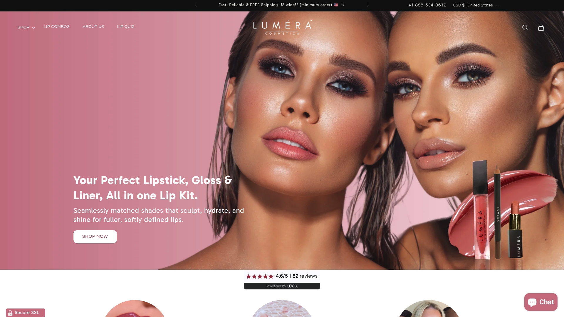
The formulas are also skincare-infused, built with comfort in mind for lips that need hydration alongside color, which matters if the dry, matte-heavy days described in the lip health section are part of your routine. Ordering is straightforward: pick the kit closest to your skin tone and undertone findings from your own swatch test, then check it against your inner-lip color once it arrives before wearing it out. If a shade in the kit runs slightly warmer or cooler than expected, the liner and gloss included give you room to adjust intensity without buying anything else.
Start by browsing the curated lip kits at Lumeracosmetica and match your undertone findings from this guide to the kit description before you order.
Sources
- The 50 best nude lipsticks for every Indian woman | Vogue India
- Lipstick Colors for Dark Skin: Top Picks for You
- 7 Best Lipstick Shades for Indian Skin Tones
FAQ
Which Color Is Best for Indian Skin Tone?
There’s no single best color, since Indian skin spans fair to deep depths and every undertone. Warm terracotta nudes and orange-based reds suit warm undertones, while blue-based berries and reds suit cool undertones, and richer, more pigmented versions of any shade tend to work better as skin gets deeper.
How Do I Know if I Have Warm or Cool Undertones?
Check whether gold or silver jewelry flatters you more, look at your inner lip color, and compare your skin against white fabric in daylight. If the results conflict, especially common on deep skin where the vein test is unreliable, treat yourself as neutral and choose shades that work across both directions.
Why Does My Lipstick Look Ashy on My Skin?
Ashiness usually comes from a low-pigment or white-based formula that mixes with your natural lip pigment instead of covering it. Switching to a higher-pigment matte or liquid matte formula typically solves this without needing to change the shade itself.
What’s the Fastest Way to Test if a Shade Actually Suits Me?
Swatch it on your inner lip, then apply a full layer on your actual lips and check the color in natural daylight rather than store lighting. Wearing it for 30 to 60 minutes will also reveal whether the undertone shifts or the formula transfers more than you’d like.
Can I Wear the Same Lipstick Shade for Day and Night?
Yes, by adjusting application rather than switching products, a light single layer works for daytime, while building the same shade in layers with liner underneath deepens it for evening wear. A dot of gloss over a matte shade also shifts it from understated to more dramatic without buying a second lipstick.


